
News > Investment Circles
How to Read Price Charts: A Guide for Investor Newbies
By Oluwatobi Ajaka • Published 1 year ago

Ever looked at a price chart and felt totally lost?
You hear experienced investors talk about trends, candles, and support levels like it's second nature, but you open a chart, and all you see is a jumble of numbers and some colored candles, and you have no idea what they mean or how they help with investing.
You’re not alone.
Many new traders feel overwhelmed by charts at first. Even seasoned investors admit they were intimidated in the beginning. But here’s the truth: once you understand the basics, price charts become one of your most powerful investing tools.
This article is your guide to understanding price charts, so you can make smarter, more informed investment decisions. But first, you need to understand just how important price charts are to any investor.
Why Price Charts Matter
You can’t make smart investment decisions without understanding how prices move, and charts help you do exactly that. They are visual tools that show how the value of an asset changes over time. Investors use them to spot
- Trends (Is it going up or down?)
- Patterns (Is it repeating?)
- Opportunities (When to buy or sell?)
Types of Price Charts
There are several types of charts, but here are the three most common that you will come across very often:
Line Chart
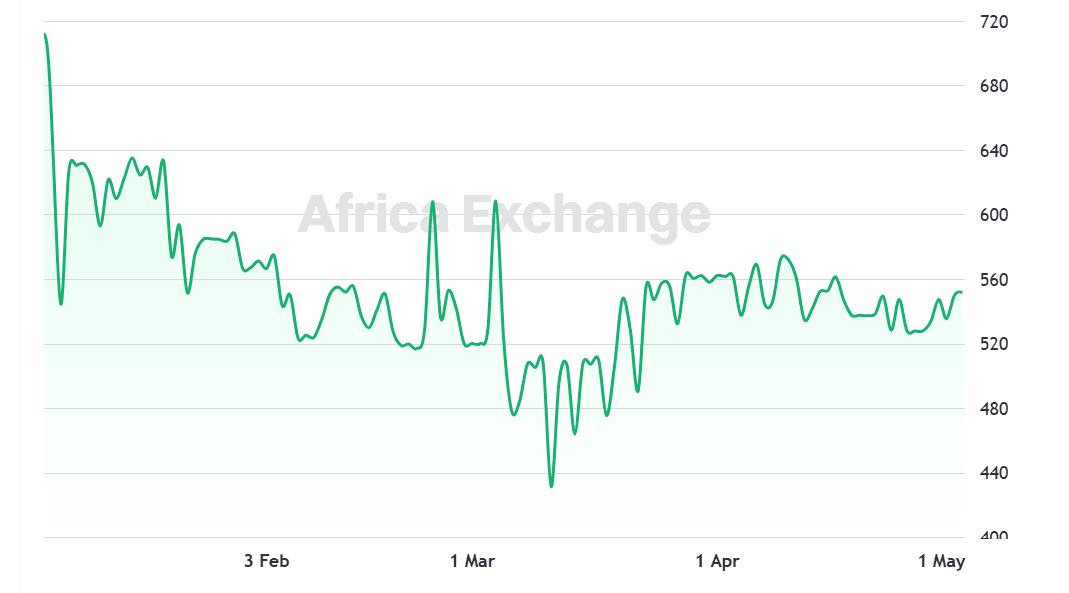
This is the simplest type. It is a simple line graph that shows closing prices over a period of time. While line charts do not give detailed information about daily trading activity, traders can still find this useful as it gives a quick overview of general trends.
Bar Chart
Bar charts are more detailed than line charts. Bar charts provide information about an asset’s price movement over a specific time period, including the open price (left tick), close price (right tick), high price (top of the vertical line), and low price (bottom of the vertical line). They help traders interpret market behavior by showing whether an asset has gained or lost value during the period: if the close price is higher than the open, the asset has gained, if the open price is higher than the close, it has decreased. Bar charts are useful for understanding price fluctuations and comparing opening and closing prices with the overall range.
Candlestick Chart
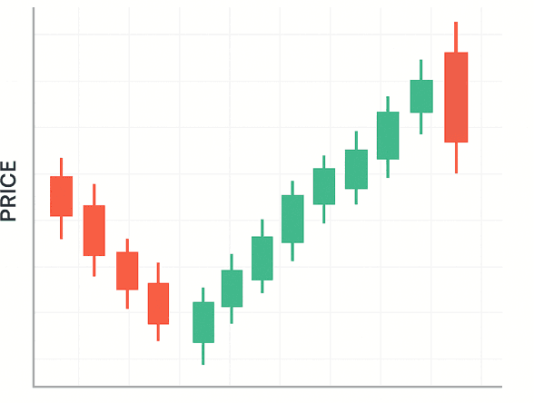
Thanks to cryptocurrencies, this is probably the most popular type of price chart. Some investors argue that the candlestick Chart is a type of bar chart. But even though they are very similar, candlestick charts are easier to read visually.
You might find this ironic because staring at a candlestick chart with the different colors and trends might give you a brain overheat as a newbie.
Each “candle” shows: Open price, Close price, High, and Low prices for a given period.
Green or white candles = price went up Red or black candles = price went down
In a bull market, you might find more clusters of green or white candles than red or black candles, while the reverse is true for a bear market.
What to Look Out for In a Price Chart
Timeframes
Charts can show price changes over minutes, hours, days, weeks, or even years. Short-Term (1D, 1H, 15min): Used for day trading or spotting quick moves. Mid-Term (1W, 1M): Great for swing traders or short-term investors. Long-Term (3M, 1Y, 5Y or more): Best for long-term investors looking at broader trends.
Trends
Trends are the general direction in which the market or asset is moving. Understanding trends helps traders identify when to enter and exit trades.
- Uptrend: An uptrend is characterized by higher highs and higher lows. This means the price is making progressively higher peaks and higher troughs. In other words, each time the price pulls back, it finds support at a higher level than before, and when it rises, it pushes up to a higher price level. An uptrend indicates a market that is in a bullish phase, and traders often look to buy during pullbacks within the trend.
Example: o Price moves from $50 → $55 (higher high), then pulls back to $52 (higher low), then moves up to $58 (another higher high).
- Downtrend: A downtrend is characterized by lower highs and lower lows. In a downtrend, each peak is lower than the previous one, and each trough is also lower than the last. This shows that sellers are in control, and the market is bearish. Swing traders look for opportunities to short (sell) during rallies or bounces within the downtrend.
Example: a. Price moves from $100 → $90 (lower high), then drops to $85 (lower low), then falls again to $80 (another lower low).
- Sideways (Consolidation): When the market is moving sideways, it is neither in an uptrend nor a downtrend. The price fluctuates within a horizontal range without a clear upward or downward direction. This is known as consolidation. Swing traders watch for breakouts or breakdowns from this range, which could signal the start of a new trend.
Example: a. Price stays between $50 and $55, moving up and down within this range without breaking through either level.
Support and Resistance
Support and resistance are key concepts in technical analysis. They are price levels where the market tends to "bounce" or "reverse," offering potential entry or exit points.
- Support: Support is a price level where demand for an asset is strong enough to prevent the price from falling further. When the price reaches a support level, buyers are more likely to enter the market, pushing the price back up. In an uptrend, support levels are typically the lowest points of previous price swings.
Example: o If a stock consistently bounces back up when it hits $100, then $100 is considered a support level.
- Resistance: Resistance is the opposite of support. It’s a price level where selling pressure tends to emerge, causing the price to reverse or stall. In a downtrend, resistance levels are typically the highest points of previous price swings.
Example: o If a stock struggles to rise above $200 multiple times and tends to fall when it hits this level, then $200 is a resistance level.
- Breakouts and Breakdowns: If the price breaks through support, it may continue to fall. Conversely, if it breaks through resistance, it could lead to further upward movement. Swing traders watch for these breakouts as potential signals to enter a trade.
Volume
Volume refers to the number of shares or contracts traded within a specific time period. It’s a measure of how much interest there is in an asset. High or low volume can provide clues about the strength or conviction behind a price movement.
-
High Volume = Strong Interest: When volume increases, it often signals that there is strong participation in the market. For instance, if a stock is rising with increasing volume, it suggests that the trend is supported by a solid amount of buying pressure, making it more likely to continue. High volume also indicates strong conviction behind a price move, whether it's a rally or a sell-off.
-
Low Volume = Less Conviction: When volume is low, it means that fewer traders are participating, and there’s less confidence behind the price movement. Low volume moves may not be sustainable, and a price move with low volume can quickly reverse as traders are less willing to commit to it.
By now, you can recognize different chart types, understand key price movements, identify support, resistance, and trends, and use volume to confirm strength That’s a huge step toward becoming a more confident investor! However, there is still more to learn. A subsequent article will discuss more technical Chart Indicators and price patterns to look out for.